
About Ant Design
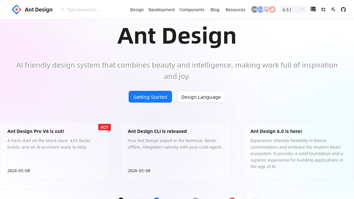
Overview Ant Design is an enterprise-class UI design language and React UI library published by Ant Group. It provides a set of high-quality React components and design patterns for building modern web applications. The library is described as the world's second most popular React UI framework and is designed for enterprises building internal tools, dashboards, management systems, and consumer-facing products. It combines design principles with ready-made UI components to reduce development work. Key Benefits Fully built-in support for flexible theme customization using open style algorithms and semantic structures that work with AI. CSS-in-JS technology provides dynamic and mixed theme capabilities without extra build configuration. Rich component library covering dashboards, data entry, navigation, feedback, and data display patterns out of the box. Ecosystem support including React, Angular, Vue, plus mobile-specific component library, Pro component library, and a charting library. Design values of certainty, meaningfulness, growth, and naturalness guide the component API and visual language. How It Works A developer installs the antd package via npm or yarn, then imports individual components such as Button, DatePicker, Table, or Form into their React application. Each component accepts props for styling, behavior, and data, and the library applies Ant Design's design system automatically through CSS-in-JS. Use Cases Enterprise front-end teams building internal dashboards and admin panels with ready-made table, form, and chart components. Startups prototyping MVPs quickly using the library's pre-built navigation, layout, and data display components. Design system teams adopting Ant Design's design language as the foundation for their own organization's UI standards. Mobile app developers using Ant Design Mobile to get a consistent cross-platform component library with the same design language as the web version. Designers using the Kitchen Sketch toolkit to create mockups that match Ant Design's component library exactly.
Ant Design Pros & Cons
- Open source and free to use
- Three framework bindings: React, Angular, Vue
- Mobile component library available
- Supportive design system and documentation
- Active community with large ecosystem
Key Features
Flexible theme customization
Open style algorithms and semantic structures allow developers and AI to customize themes without writing CSS overrides.
CSS-in-JS engine
Components use runtime CSS-in-JS to provide dynamic and mixed theme support without additional tooling.
Rich component library
A complete set of enterprise UI components including Table, Form, DatePicker, Modal, Button, and Dropdown ready for import.
Multi-framework support
Official libraries support React, Angular, and Vue frameworks so teams can keep the same design language across stacks.
Mobile UI components
A mobile-tailored component library that shares the same design principles and visual language as the desktop version.
Pro component suite
A library of higher-level business components and layouts for building admin interfaces faster.
Design principles
Guiding values of certainty, meaningfulness, growth, and naturalness that shape component APIs and visual decisions.
Designer toolkit
A Sketch plugin and component set that lets designers build interfaces matching the library's production components.
Charting library
A data visualization solution from the same ecosystem offering chart components that complement Ant Design's UI components.
Ant Design Pricing
Pricing extracted from the product website and may change. Check the source for current details.