About PrimeReact
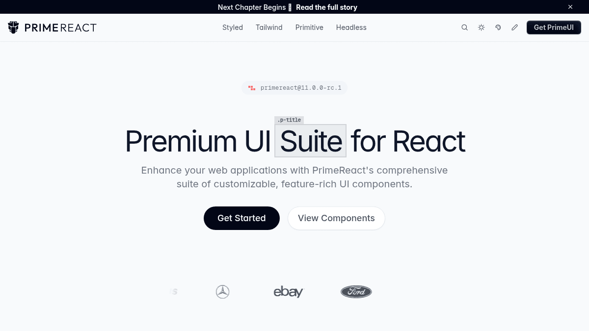
Overview PrimeReact is an open-source React UI component library that provides over 130 production-ready components. It covers everything from data tables and charts to dialogs and menus, and it works with any SSR framework including Next.js, Remix, Astro, and Vite. The library gives developers four architecture layers — headless, primitives, styled, and Tailwind — so they pick the abstraction that fits their project. Every component is WCAG compliant with built-in keyboard navigation, screen reader support, ARIA attributes, and focus management. Key Benefits Tree-shakeable builds keep gzipped bundle size at ~12 KB. Full TypeScript support provides type safety and auto-complete for every prop, event, and ref. Over 130 components cover data tables, charts, dialogs, menus, and more out of the box. Four-tier architecture (headless, primitives, styled, Tailwind) lets teams choose their abstraction level per component. WCAG-compliant components handle keyboard navigation, screen readers, and focus management automatically. How It Works You install the package with npm install primereact , import any component from primereact , and pass your data as props. For the Dialog component, you can choose between the headless useDialog hook (you write all markup), the primitives.tsx layer (base markup with no styles), the styled.tsx layer (pre-styled), or the tailwind.tsx layer (Tailwind-based styling). To theme your app, you define a preset using the design-token system — set colors, spacing, border radius, and font size in one place, or override per component. Use Cases React developers building internal admin dashboards who need a DataTable with sorting, filtering, and pagination out of the box. Frontend teams at agencies that customise every pixel — they use the headless layer to own all markup while keeping PrimeReact's logic. Design-system maintainers who want a pre-built, accessible Dialog that they can restyle through design tokens without touching component internals. Indie makers shipping a SaaS landing page who drop in PrimeReact's chart components for portfolio and wallet-data visualisation. Enterprise teams that require WCAG compliance — every PrimeReact component ships with keyboard navigation, screen reader support, and ARIA attributes enabled by default. Why Choose This Product PrimeReact suits any React team that wants a large, well-tested component library without being locked into one styling paradigm. The four-layer architecture (headless, primitives, styled, Tailwind) is its main differentiator. The library does not enforce a specific design language; you bring your own theme via design tokens. No limitations are surfaced on the page beyond the library requiring React as a runtime dependency.
PrimeReact Pros & Cons
- 130+ production-ready components
- Four-layer abstraction (headless to Tailwind)
- WCAG-compliant by default
- Tree-shakeable ~12 KB gzipped
- Design-token theming system
Key Features
130+ Components
Over 130 production-ready components including DataTable, Chart, Dialog, and Menu.
Four-Layer Architecture
Components are available at four abstraction levels: headless, primitives, styled, and Tailwind.
Design Token Theming
Define colors, spacing, border radius, and more in a single preset or override per component.
WCAG Accessibility
Every component supports keyboard navigation, screen readers, ARIA attributes, and focus management.
Tree Shakeable
Tree-shakeable builds with dead-code elimination; gzipped bundle size is approximately 12 KB.
TypeScript Support
Every prop, event, and ref includes full type definitions for auto-complete and type safety.
SSR Ready
Works with Next.js, Remix, Astro, Vite, and TanStack, supporting server components and streaming.
Quick Start
Import a component and pass data without boilerplate or setup ceremony.
PrimeReact Pricing
- 130+ React UI components
- Four-layer architecture (headless, primitives, styled, Tailwind)
- Design-token theming system
- WCAG-compliant accessibility
- Tree-shakeable builds
- TypeScript support
Pricing extracted from the product website and may change. Check the source for current details.
Frequently asked questions about PrimeReact
How do I get started with PrimeReact?
Run npm install primereact, import a component from 'primereact', and pass your data. No boilerplate or setup ceremony is required.
Does PrimeReact support headless or unstyled usage?
Yes. PrimeReact offers four layers: headless (logic only, you write the markup), primitives (base HTML structure, no styles), styled (fully styled components), and Tailwind (components styled with Tailwind utility classes).
How does theming work in PrimeReact?
You set a single preset defining colors, spacing, border radius, and font size — or override tokens per component. The library provides ready-made themes: Aura, Lara, Nora, Material, and Tailwind.
Is PrimeReact accessible?
Yes. Every component is WCAG compliant with built-in keyboard navigation, screen reader support, ARIA attributes, and focus management.
Is PrimeReact free?
Yes — PrimeReact is free to use. See the pricing section for any optional add-ons.
How much does PrimeReact cost?
PrimeReact offers the following plans: Community. See the pricing section for what's included in each tier and any per-seat or usage-based costs.