
About LT Browser
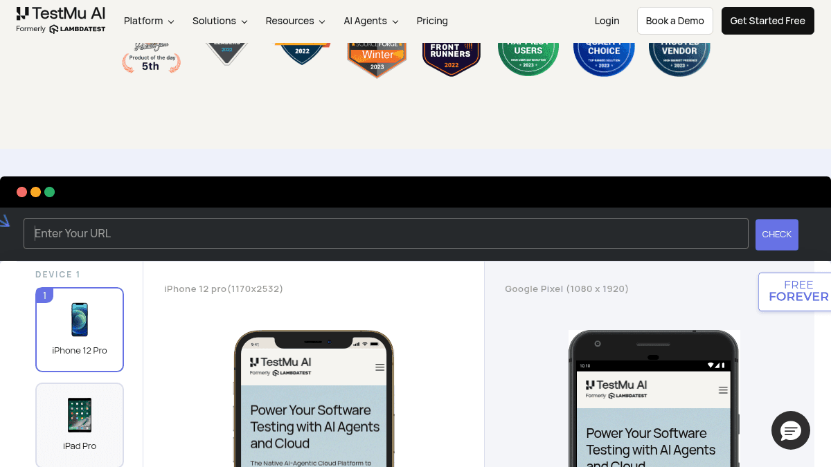
Overview LT Browser is a desktop browser built specifically for web developers who need to create, test, and debug mobile-responsive websites. It replaces the workflow of manually resizing browser windows or relying on basic device-emulation tabs. Instead of jumping between Chrome DevTools and a separate mobile emulator, developers open one dedicated browser that shows two device viewports side by side. LT Browser ships with over 50 pre-installed device profiles covering Android phones, iPhones, iPads, and common desktop resolutions, along with custom resolution support. Key Benefits View two device screens simultaneously — for example an iPhone 12 Pro and an iPad Pro — so you can compare layouts without switching tabs. Debug mobile-view websites that refuse to load in iframes; LT Browser explicitly handles those connection errors. Perform live mobile-view debugging with real-time changes reflected across selected device viewports. Access pre-installed Android and iOS viewports plus the ability to set custom mobile resolutions. Supported on Windows 7+, macOS 10.10+, and Ubuntu 12.04+ (Debian and RPM packages available for Linux). How It Works You download LT Browser for your operating system, then launch the application. You pick a device from the dropdown — for instance iPhone 12 Pro — and the browser renders your website at that device's viewport. You can add a second device, selecting e.g. iPad Pro, so both viewports display side by side. From there you inspect layout, debug CSS, and refresh either device independently while seeing how changes behave at each screen size. Use Cases Frontend developers debugging responsive CSS layouts across iPhone, Android, and tablet viewports without leaving a single browser window. QA engineers verifying that a mobile site renders correctly on both an iOS device and an Android device in one glance. UX designers checking how design changes appear across 50+ device profiles before committing code. Web developers testing local or staged websites at custom resolutions outside the pre-installed device list. Freelance web developers who need a free, dedicated tool for responsive testing without subscribing to a cloud testing service. Why Choose This Product LT Browser is ideal for developers who test responsive designs regularly and want a standalone tool that runs on their desktop rather than a browser extension or cloud service. The product is free to download and use. It does not test on real devices; its device profiles are emulated viewports, so it cannot detect real-device issues such as pinch-to-zoom gesture behavior, device-specific crash logs, or battery-drain problems that only surface on physical hardware.
LT Browser Pros & Cons
- Free to download and use
- 50+ pre-installed device viewports
- Side-by-side phone and tablet comparison
- Cross-platform: Windows, macOS, Linux
Key Features
Split-screen device view
View two device viewports (e.g., iPhone and iPad) next to each other in a single browser window.
50+ pre-installed devices
Pre-loaded profiles for over 50 devices including Android phones, iPhones, iPads, and standard desktop resolutions.
Custom resolution support
Set any custom screen width and height not already in the pre-installed device list.
Live mobile-view debugging
Inspect and debug live mobile-view websites directly in the browser, including sites that refuse to load in iframes.
Phone-to-tablet comparison
Compare how a website renders on a mobile phone next to a tablet simultaneously.
Cross-platform desktop app
Available as native installers for Windows, macOS, and Linux (Debian and RPM packages).
LT Browser Pricing
View full pricing →Pricing extracted from the product website and may change. Check the source for current details.