
About Shopify Polaris
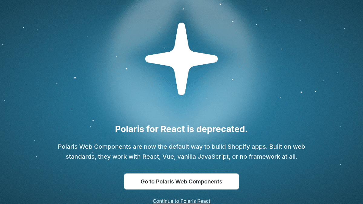
Overview Shopify Polaris is a design system for building Shopify admin experiences. It provides reusable components, design tokens, and icons for creating consistent commerce interfaces. The system is aimed at developers building Shopify apps and custom admin experiences. Polaris Web Components have replaced the React version as the default way to build, working with React, Vue, vanilla JavaScript, or no framework at all. Key Benefits Over 400 carefully designed icons focused on commerce and entrepreneurship. Design tokens codify decisions for color, spacing, typography, and more. Web components work with React, Vue, vanilla JavaScript, or no framework. Built on web standards for broad compatibility across modern browsers. How It Works You install the Polaris Web Components package and import the components you need into your project. Each component renders a Shopify-admin-consistent UI element using design tokens for color, spacing, and typography. You compose these components together to build your app's admin interface. Use Cases Shopify app developers building custom admin interfaces for merchants. Front-end engineers at Shopify partner agencies creating consistent commerce dashboards. Designers and developers collaborating on Shopify admin experiences using shared design tokens. Teams migrating from Polaris React to the newer web-standards-based Polaris Web Components. Why Choose This Product Polaris is best suited for anyone building Shopify admin interfaces — from app developers to partner agencies. The React version is deprecated in favor of Polaris Web Components, which work across frameworks. No pricing information is available as this is an open-source design system. https://polaris.shopify.com/
Shopify Polaris Pros & Cons
- Over 400 commerce-focused icons
- Works with any JavaScript framework
- Built on web standards
- Open-source and free to use
- Design tokens for consistent theming
- Polaris React version is deprecated
- Designed specifically for Shopify admin interfaces only
Key Features
Reusable Components
Polaris provides reusable elements and styles, packaged through code, for building admin interfaces.
Design Tokens
Coded names that represent design decisions for color, spacing, typography, and more.
Icon Library
Over 400 carefully designed icons focused on commerce and entrepreneurship.
Web Components
Built on web standards, Polaris Web Components work with React, Vue, vanilla JavaScript, or no framework at all.
Foundations Guidance
Fundamental design guidance for creating quality admin experiences.
Content Patterns
Design guidance and content patterns for building consistent admin interfaces.
Shopify Polaris Pricing
Pricing extracted from the product website and may change. Check the source for current details.